How Tesla Can Fix its Blind Spot Camera Interface [VIDEOS]

Back in December, Tesla’s holiday update introduced a new user interface, while also added a Blind Spot Camera feature, enabling live camera views on vehicle displays when turn signals are pressed.
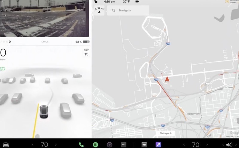
The problem with the feature? The live camera views from the Blind Spot Camera shows up in the bottom left corner of the screen, which is not very intuitive, especially when you’re signalling left, as your head has to look down to the right.
But a new concept imagined by Felix Wepunkt has introduced a couple of fixes for the Blind Spot Camera, in particular having the live view drop down from the upper left. This allows drivers to quickly glance and see what’s happening instead of looking down. Check it out below:
Hey @elonmusk & @Tesla what do you think about this positioning of the Blind Spot camera?
I think it would be better to see so at first glance. pic.twitter.com/W2Bzm0y8wl— Felix Wepunkt (@fel_iix) March 2, 2022
Another concept from Felix shows a larger Blind Spot Camera view show up on the right side of vehicle displays, in a much larger view. This makes for an easier view of the screen, as sometimes your right arm can be blocking the lower left where the Blind Spot Camera usually appears.
Like this? pic.twitter.com/wn3FKiEVUN
— Felix Wepunkt (@fel_iix) March 2, 2022
The Blind Spot Camera initially suffered from glare when signalling, but Tesla used a low-tech solution (answer: tape) to address the issue for newer vehicles.
How do you like the position of the Blind Spot Camera on your Tesla display?
Want to see more of our stories on Google?

P.S. — Buying a new Tesla? Click here to save $1,000 USD, while supporting independent news.
Help support us by shopping on Amazon here.
Links in this post are affiliate links, so we earn a tiny commission at no charge to you. Thanks for supporting independent media!

The top left makes sense, so we don’t have to look down when changing to the left lane. Another ‘bug’ is if I receive a text message and need to use the turn signal, the text message disappears! I wouldn’t be able to get a chance to click to read it.
Isn’t the real “right answer” to have a warning light on the side view mirrors like every other car, or to have the side camera feed in a display behind the steering wheel that allows you to keep your eyes on the road, like in the Hyundai Tucson?