Tesla Owner Redesigns “Cheap Looking” User Interface in Holiday Update

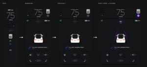
One Tesla owner’s re-design of the new Autopilot user interface. Photo: Reddit user u/jentheunicorns
Tesla’s latest 2020 holiday update brought some goodies, such as a redesigned user interface, boombox feature and more. This latest update appears to be receiving mixed reviews, specifically the slightly reduced map screen and larger visualizations screen on the left.
Reddit user u/jentheunicorns has done a complete redesign of Tesla’s new user interface (UI) update, including multiple flexible layout options, and others on the thread are loving it.
The user says she had issues with Tesla’s newer UI design; namely, the sheer size of the large driver panel, as well as “cheap-looking” placements of the instrument cluster and the speedometer. In addition, she cites the need for a “much bigger navigation area,” as a primary concern.
@elonmusk @Tesla the new M3 UI update is a design disaster. Very un-Tesla-like. Shame 🙁
— Ken Laji (@kenlaji) December 28, 2020
While the new design won’t likely change whether or not the company will reach its goal of half a million deliveries in 2020, it does significantly affect current Tesla owners, and those going forward.
As is echoed on the Reddit thread, it just might be a good idea for Reddit user u/jentheunicorns to pass her work along to Tesla, since it seems the design team may be on vacation right now.
What do you think of the new user interface in the 2020 holiday update and this concept? Yay or nay?
Want to see more of our stories on Google?

P.S. — Buying a new Tesla? Click here to save $1,000 USD, while supporting independent news.
Help support us by shopping on Amazon here.
Links in this post are affiliate links, so we earn a tiny commission at no charge to you. Thanks for supporting independent media!
