Tesla Tweaks Website to Show Rectangular Buttons, Sharp Corners like Cybertruck

Tesla has modified its website design to introduce rectangular buttons, eliminating the pill-shaped designs from before.
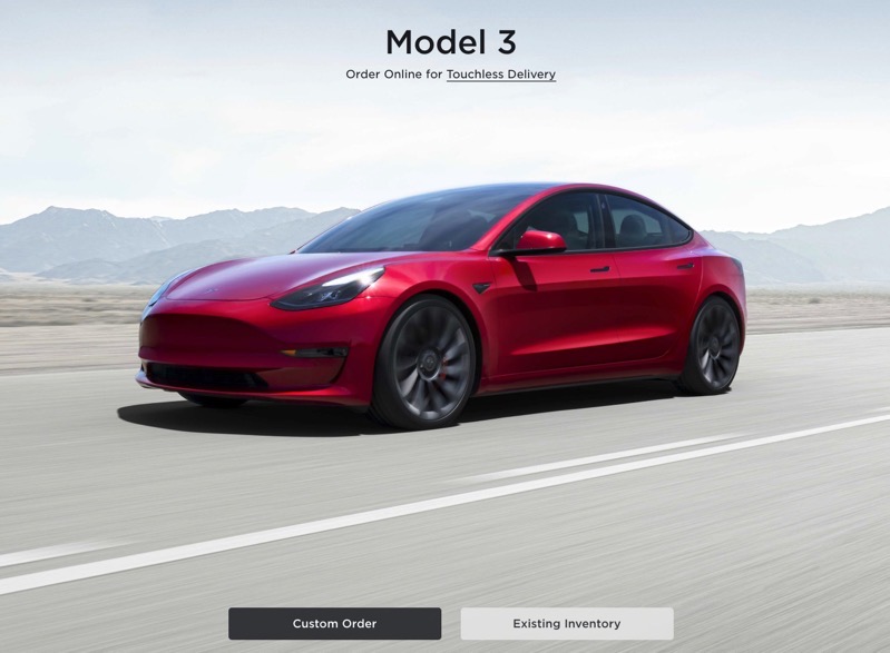
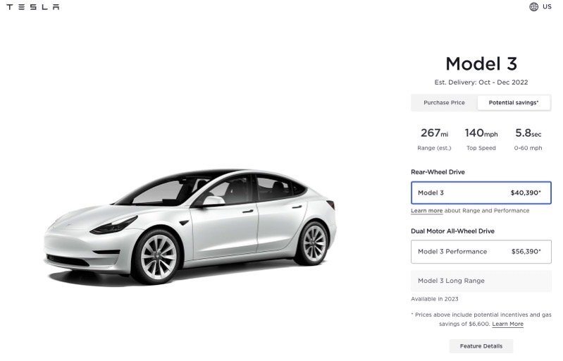
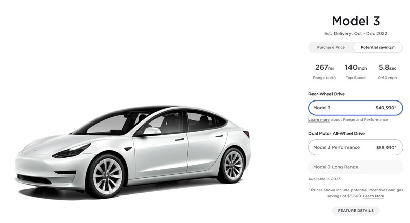
The electric automaker’s main site now shows “custom order” and “existing inventory” buttons as rectangles, while on configuration pages, rounded corners are a thing of the past, as sharp rectangular buttons are now commonplace, seemingly leading us towards the launch of Cybertruck in mid-2023.
Here’s the new design below, for example:

…and here’s the old design:

The change was seen last night by numerous Tesla fans, including @corey_aronson.
We first started seeing rectangular buttons in the Tesla mobile app on its main screen at the bottom, as ‘Specs & Warranty’ and ‘Manage Drivers’ buttons are similarly showing with the same design.
Rounded corners from the design of Tesla’s Model S/X and Model 3/Y are set to get turned upside down when the sharp corners and straight lines of Cybertruck make their debut next year, with Elon Musk saying first deliveries will be set for mid-2023.
Want to see more of our stories on Google?

P.S. — Buying a new Tesla? Click here to save $1,000 USD, while supporting independent news.
Help support us by shopping on Amazon here.
Links in this post are affiliate links, so we earn a tiny commission at no charge to you. Thanks for supporting independent media!

Is this a change or did some dev simply forget to set the radius for buttons? LOL!
Haha, only if it were that easy 😉
I find Tesla’s decision to align the website’s button style with the Cybertruck aesthetic really interesting. It shows how even subtle design changes can strengthen brand identity and create a more cohesive experience across products and digital touchpoints. This kind of attention to detail is exactly what I appreciate in an ux design service —it’s not only about functionality but also about translating a company’s vision into visual and interactive elements. Consistent design systems help users feel more connected to the brand, and I think this update is a great example of strategy and design working hand in hand.