Lucid Motors Unveils its Minimal Dashboard, In-Car User Experience [VIDEO]

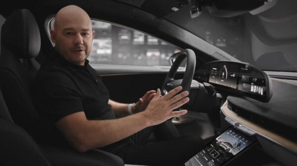
In a video shared on Wednesday by Lucid Motors, the electric vehicle (EV) manufacturer showed various features of its user experience (UX) design and how the elements were created with humans in mind.
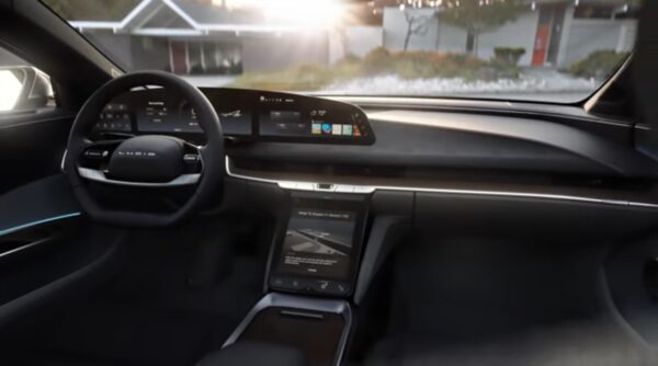
Among the shots included in the video include the Lucid Air’s dashboard and innovative interactions, as well as breakdowns of how the UX will function while the vehicle is driving.
The Lucid Air’s user interface itself is sleek, featuring a minimalistic digital interface that stretches from the driver’s seat to halfway across the dashboard, and a touch screen in the center of the front seats – a little lower, seemingly, than Tesla’s.

In addition, the video shows us how the Lucid Air’s screens work together, with a shot of the host dragging a window from the dashboard/driver interface down to the middle compartment screen.
In addition, the video features some of the force touch buttons located just below the right side of the dashboard/driver interface, which can apparently be used for things like adjusting volume and air conditioning.
Despite the Lucid CEO being unsure of hitting 20,000 in production by 2022, a number that pales in comparison to Tesla’s sales, the company’s Air sedan is looking pretty stunning, especially with such a simplistic, user-friendly digital and software interface.
You can see Lucid’s full breakdown of the Lucid Air electric sedan’s purpose-built, human-driven User Experience system below:
https://www.youtube.com/watch?v=vxE4P85DSBw
Want to see more of our stories on Google?

P.S. — Buying a new Tesla? Click here to save $1,000 USD, while supporting independent news.
Help support us by shopping on Amazon here.
Links in this post are affiliate links, so we earn a tiny commission at no charge to you. Thanks for supporting independent media!

