Designer Imagines Apple Car Interface Based on Tesla Model 3 [VIDEO]

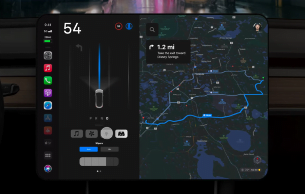
A concept design of what Apple Car’s user interface could look like. Photo/Design: John Calkins
Rumors about Apple’s upcoming electric vehicle (EV) have been making their way around internet communities for a few months now, and many are speculating as to what the car’s software design could be like.
On Monday, 9to5Mac shared graphic designer John Calkins’ rendering of a new Apple Car user interface concept, designed for a 15-inch center console display similar to Tesla’s Model 3 infotainment system.
The resulting design is sleek, and very on-brand for Apple, even though we likely won’t see an Apple Car in what many are saying a half-decade or longer.
In the design concept, Calkins laid out three separate sections of the display. From left-to-right, the concept design includes a minimal list of apps, then a column section with the driving visualizer and a quick access menu, and on the right half of the screen, the map and navigation information that you’d expect to see in a Tesla.
While the design is largely based on what Tesla’s UI looks like, it includes the added touch of Apple’s stylistic look and polish, giving it a cohesive feel with the rest of Apple’s products.
You can see Calkins’ full Apple Car UI concept design below:

Want to see more of our stories on Google?

P.S. — Buying a new Tesla? Click here to save $1,000 USD, while supporting independent news.
Help support us by shopping on Amazon here.
Links in this post are affiliate links, so we earn a tiny commission at no charge to you. Thanks for supporting independent media!

